Blog
antique-inspired color charts | Miss Mustard Seed
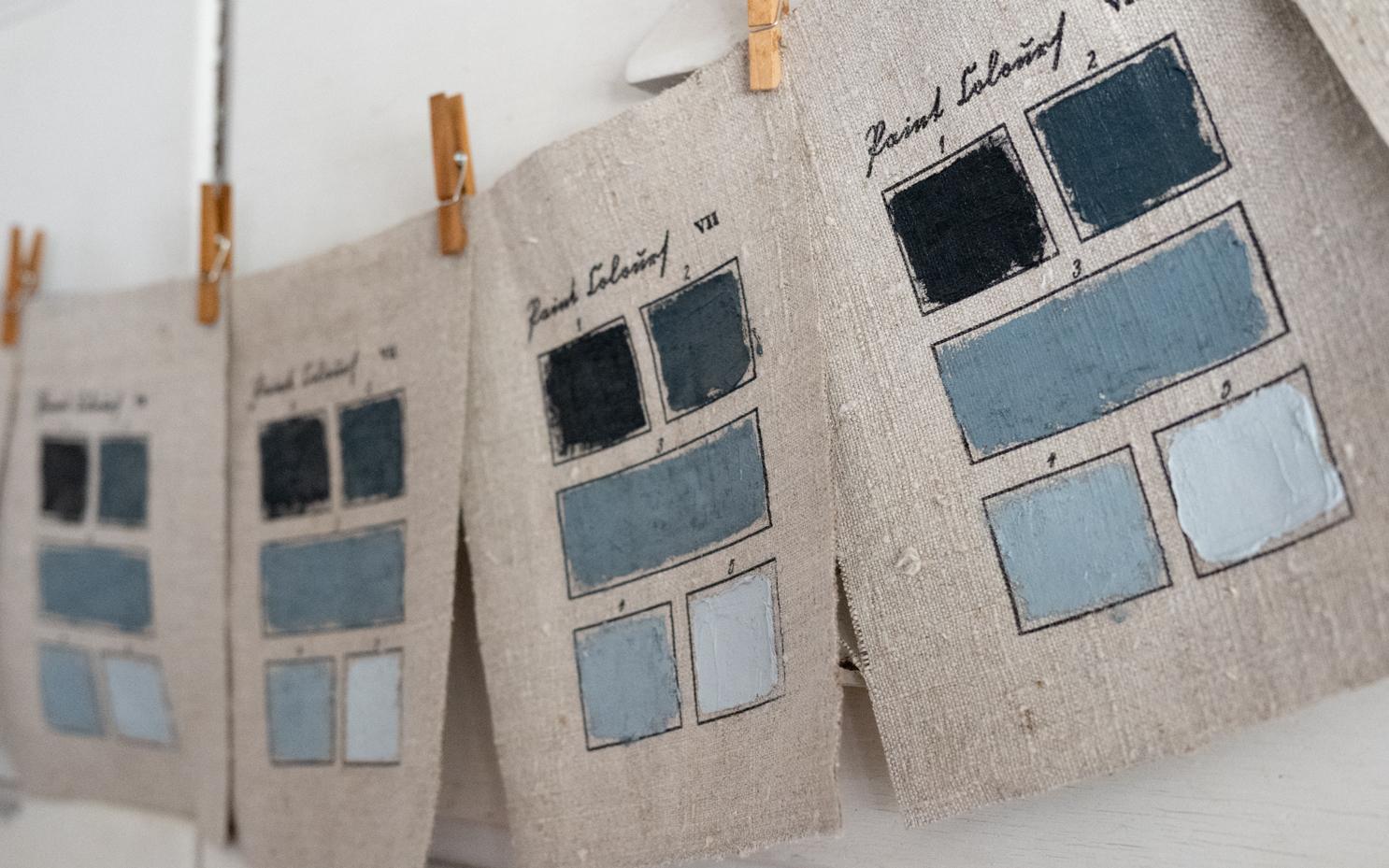
I’ve been making and selling color charts on linen for a few years. My first one was inspired by color charts found at an artist’s estate sale. I was so smitten with them when I first spotted them online – the colorful squares in oil framed by age-stained fabric – that I decided to make some of my own. I made small color studies on antique linen and hemp scraps, testing different ways to tape off the squares and apply the paint. As I was working on a new batch for my original art sale earlier this year, I had an idea. What if I could stamp a color chart template onto paper and/or fabric and then apply the colors? Would that work? Would it look good?
I tested out stamps I already had to label the back of my paintings to see how well the ink would transfer to nubby antique linen. I also tested it on watercolor paper to make sure the ink wouldn’t run. Oh my gosh…it worked! Now, I just need to design the stamps.
The first stamp was based on A. Boogert’s Treatise on Colors Used for Water-Based Paint, 1692. I actually bought a replica of this almost-800-page book and often flip through it just to admire the color swatches. I’ve seen prints made from this book sold online, and I thought the design would be perfect for my idea.
I made a graphic with text and squares and had it custom-made into a stamp. I was giddy the first time I inked it up and pressed it into the fabric. It looks so good! over the weekend, I wanted to work on something creative, so I ironed some antique linen from my stash, cut it into 6 x 8″ pieces, applied the stamps, and smeared on the paint using a palette knife. I made blue swatches this weekend, but I’m going to make some more color studies.
They’ll be sold in my next original art sale, matted in an 8 x 10 white mat, so they can be popped into a standard frame.
The second stamp I made is based on Richard Waller’s “Tabula Colorum Physiologica”, from “A Catalogue of Simple and Mixt Colours with a Specimen of Each Colour Prefixt Its Properties,” in Philosophical Transactions of the Royal Society of London, vol. 6 for the years 1686 and 1687 (1688).
I made the graph and added text in a font I knew would be illegible, but I wanted it that way. I used words for historical pigments, some of them in Latin. My initials are even snuck into the first box in a way no one would notice unless I pointed it out.
I did a palette study of blues and greens made from the pigments dotted on the left.
As I was making these, I actually thought, I am so glad I get to make things I love. What a privilege.
I tried both versions of my hand-painted, antique-inspired color charts in frames I had in my stash for oil paintings. I am so excited with how they turned out. These will be great budget-friendly originals I can put in my art sales. I am already working on a few more designs, and will be doing some of these in watercolor as well…